With Maps4News you can make a variety of different maps. Each map type can communicate a different aspect of a news story. Here we explain the power of each map type and why you should use it.
The ‘Where?’ of a story
The ‘Where?’ of story is one of the ‘5 W’ questions a good news story should answer (the other ones being ‘Who?’, ‘What?’, ‘When?’ and ‘Why?’). Through the where of a story, readers can assess the relevance of a story to their own lives. Did something happen closeby to where they live? Or maybe something happened in a place where relatives or friends are living, or a place they once visited? That is why the location of a story matters and can connect to readers.
Many readers also lack the geographical knowledge to pinpoint Manchester, Madagascar, Malaysia or Marlborough Road and relate those locations to places they are familiar with. This is especially the case when these place names are only mentioned in text. A locator map connects the dots between what places the reader knows and where that wildfire is burning, where that car crash happened, in what country those floods are happening and where the World Cup is played.
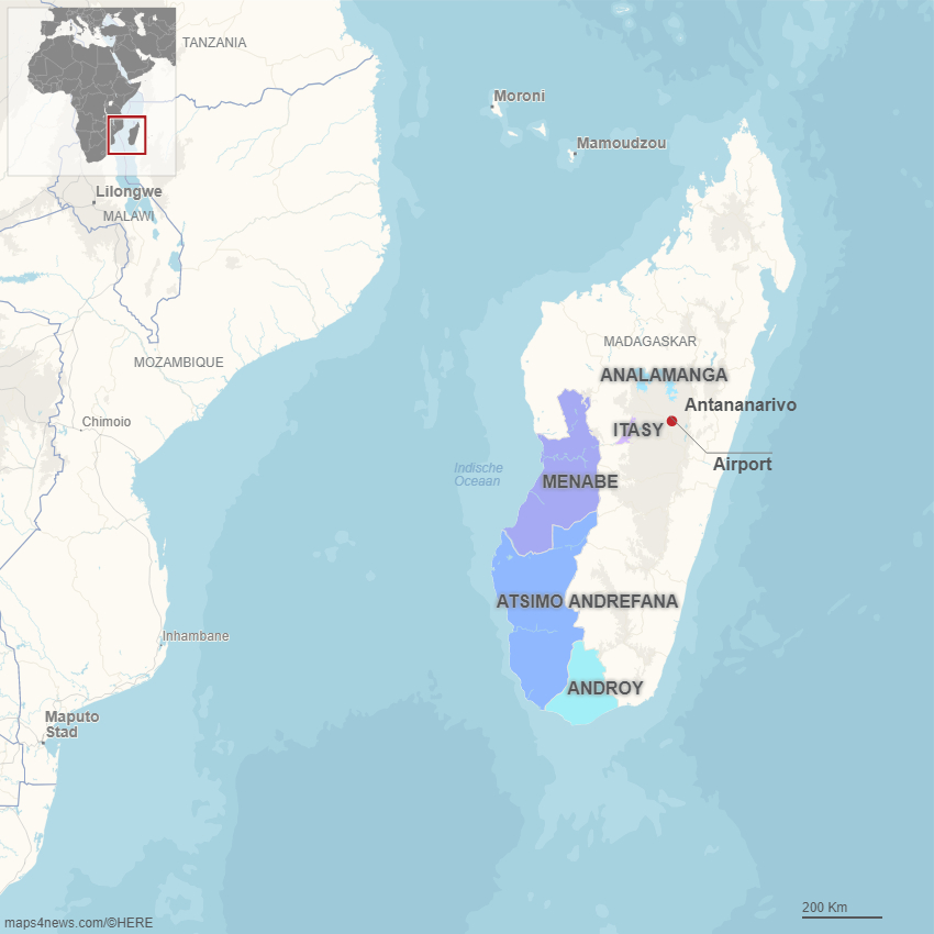
By using a small inset map, locator maps can connect to readers at different levels. People not familiar with the location of a distant country can see where it is located on the globe or within its continent, while at the same time readers with some knowledge of the country’s geography can see where in the country a news story unfolded and see how close things happened to the places they know.
How? How big? How far? How many?
But maps can do more than showing only the ‘Where?’ of a story. Maps can also show how a sequence of events occurred and show additional information to contextualize the story. By adding markers, lines, polygons and text to a map, people familiar with the location will be able to mentally replay what happened on the ground by connecting what’s on the map with how they know the place.
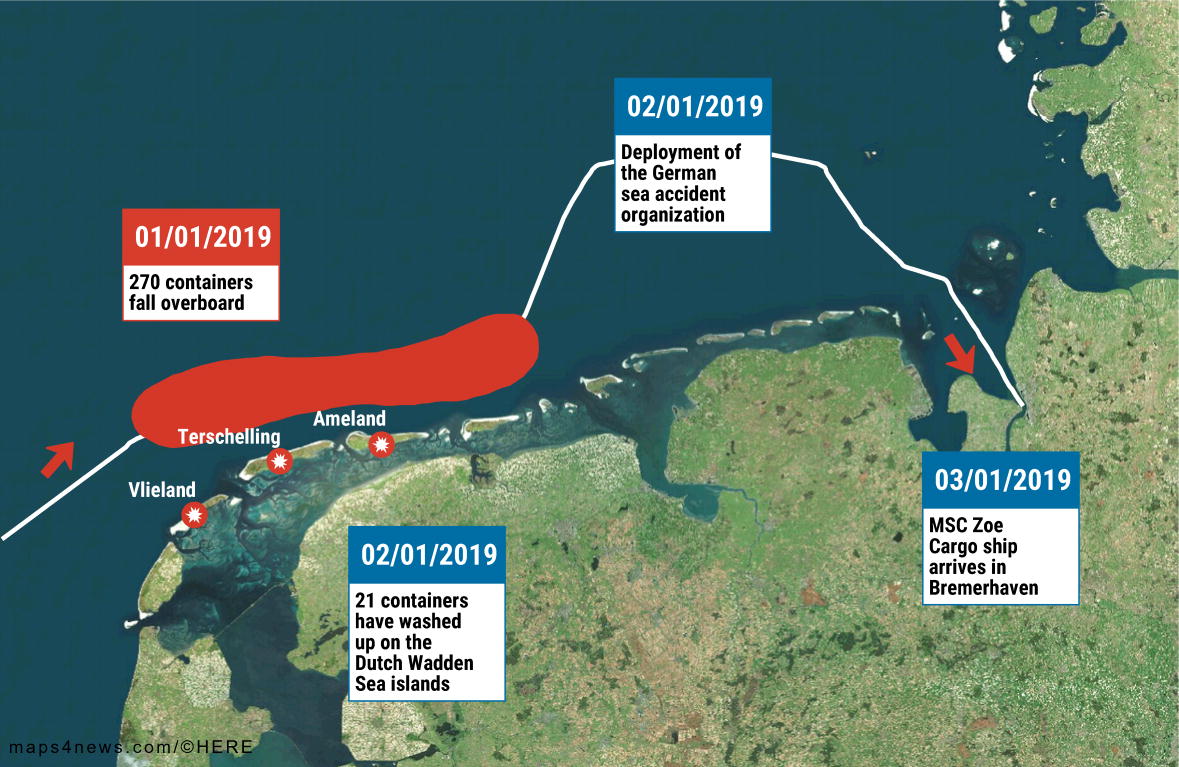
Lines on the map can show distances between locations, routes taken by ships, cars or planes or any kind of connections between locations. Polygons can be used to show the extent of wildfires or oil spills, the outline of all the development projects in a city or the demarcation of an evacuation zone. Callouts and other text annotations focus the attention of the reader to what is important and explain how the map should be read. And markers with varying shapes, sizes and colors can convey information about different categories of events and locations, like roadblocks, protests and riots in a country, or the summer happenings in a city.
A medicine for “red dot fever”
But what if you want to show the hundreds of bars and restaurants in a city all at once? The locations of all traffic accidents in your country? Or all the armed conflicts in the world? It would be very hard to show all these locations on a single static map without using some filtering or aggregation. In order to show every single location, the map needs to be converted to a dynamic map.
These maps are usually less editorial and are more like a service to the reader. The map author doesn’t specify what he thinks are the most important elements on the map. Instead, he gives the data in the hands of the user and let the user explore the areas on the map of most interest to him. Therefore, user controls are crucial in these maps: it should be easy to zoom in and out, to find specific areas and filter the displayed features on the map, on all kinds of devices.
Special attention needs to be payed to the number of displayed features on the map, as these maps have a tendency to get crowded very quickly (a phenomenon sometimes called “red dot fever”), especially when the user zooms out. One technique to overcome this ( and is implemented in Maps4News), is clustering. When map markers are too dense and overcrowd the map, they are clustered together. In that way the user still has an idea of the spatial distribution of the markers without the markers overlapping each other and hiding the base map.
Clustered map:
Red dot fever:
The base map used in a multiple location map should recede to the background. It should only help the user to orientate himself, it should not attract attention away from the most important elements on the map, which are the markers.
Numbers on the map
One of the most ubiquitous map types used in news rooms, especially in times of elections, are choropleth maps. Choropleth maps (often mistakenly called chloropleth maps) are maps on which polygons communicate (typically numeric) values by representing them with colors.
Choropleth expample:
Choropleth maps can be excellent storytelling devices. But it is very easy to make misleading choropleth maps too. A very common mistake is using absolute instead of relative numbers. Take for instance a map depicting the absolute number of people voting for a particular party in every municipality of a country. You’ll see the urban municipalities stand out on the map, the rural areas will take less visual presence. Does this mean that that party is more popular in cities than in rural areas? You can’t tell, because you should take into account the population in each municipality. In order to be able to compare areas on a choropleth map, their values should be scaled. They should be rates, or percentages: the number of voters for a party divided by the the total voting population is a better measure to be mapped on a choropleth map.
A choropleth with absolute numbers:
Choropleth maps can go wrong in many other ways too. The color scale, the class breaks of the color scale, the map projection and the background map all determine how users will be able to (mis)interpret the numbers on the map. Designing good choropleth maps is a skill into which we delve a little deeper in a future blog post. Done right, a choropleth map can show geographical patterns in data much more effectively than text alone can. Most readers nowadays have no problem reading choropleth maps, and with some annotations or search functionality, they will be able to quickly assess the data values for their own area (and compare it with neighboring ones).
The list of interesting datasets you can visualize on choropleth maps goes well beyond election results. Demographic data (population density, birth rates, …), social statistics (crime rates, education levels, …), economic data (gdp per capita, unemployment rates, …), numbers related to health (incidence rates, mortality, …), environmental statistics, transportation data: the list of datasets showing geographical patterns that might be of interest to readers is endless.
What story are you going to tell with maps?

About Maarten Lambrechts
Maarten Lambrechts is a freelance data journalist and visualisation consultant from Belgium. He designs and develops static and interactive visualisations to help organisations communicate with data. Often this involves making maps, which he, being a cartophile, absolutely enjoys. You can find examples of his work on www.maartenlambrechts.com and you can follow him on Twitter as @maartenzam .
Would you like to try creating some maps yourself?


