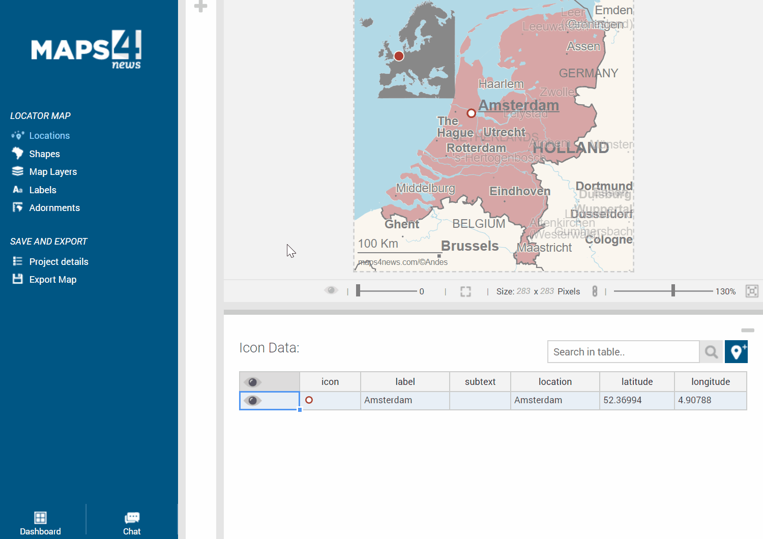
You will notice that some of the labels appear in a stronger colour than some others. Especially if you move labels around, it might look like this:
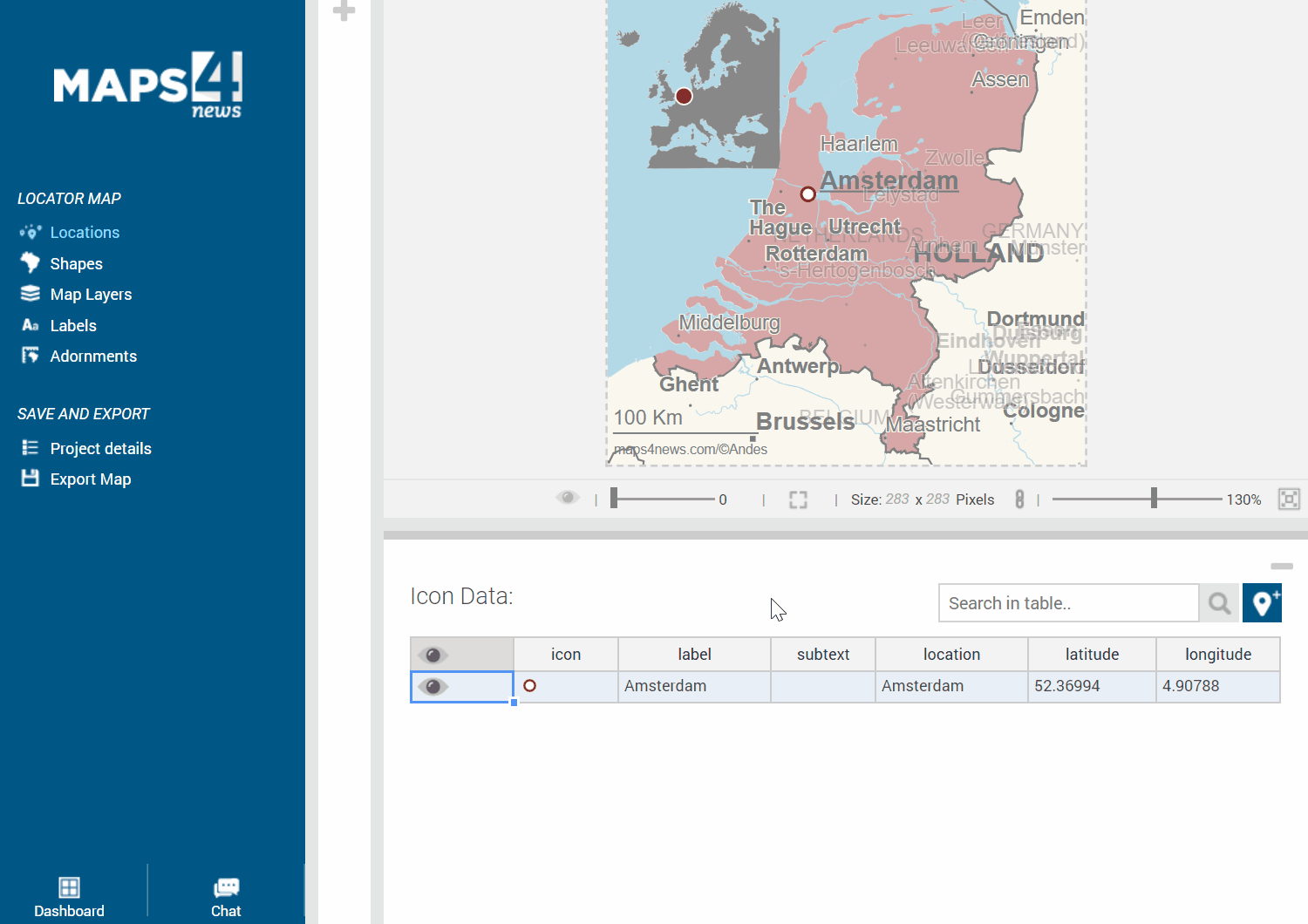
This is just an indicator about the amount of available labels for this map. Click on the “Eye-Icon” and you’ll see the map preview of the exported version. You can also move the little bar in the bottom of the map, which will automatically increase or decrease the margin around the labels. Thus, some labels will appear or disappear automatically and the map will become more or less dense.